Kepi: Startup
Role: Art Direction • Design
Services: Strategy • Logo • Stationery System • Packaging
The owner of a successful restaurant chain created a new startup company to target parents of newborns with a new swaddle blanket system. It needed a new name and brand personality.
-
If you grew up in a Jewish household, you may well know what this means. Even if you didn’t, as most of our customers certainly will not have, the term which is Yiddish for head, specifically a child’s head, has come to have a universal appeal. For those that grew up with a Bubbie or a Zadie, they can probably attest to the feeling of warmth, love and security felt when a hand was placed on their head and they were told to “lay keppie” or “lay your kepala” Our new product offers that same sense of warmth and protection, like a parent’s caring hand to the head. But while this was the origin and inspiration of the name, Kepi or Keppie has other qualities that regardless of entomology will have real appeal. Kepi is small and precious like a child. In its four-letter form, like the French military cap of the same name which also utilized design to designate style, rank and importance, Kepi simply looks appealing. The leading “K” character recalls the word Kinder, making the word feel more European or Scandinavian—something that can be emulated through a clean, colorful, sophisticated design that will also add elevated value to the product. For all of these reasons— the visual appeal and easy memorability of the word form, it’s diminutive aural qualities that sound like a product for babies, and mostly the way that the word simply makes us feel - bright, happy, new, tender and caring—we think Kepi/Keppie would be a strong name for our product.
Early Studies
Final Logo
Tagline Layout Study
Corporate Stationary Design System
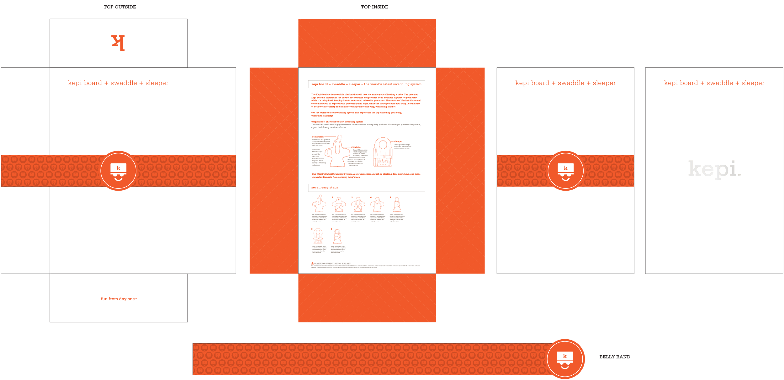
Package Design
Custom Shopping Bag Design


